16.08.2024
How we almost rescued our qubit video

16.08.2024

In our previous article, we explored different concepts for visualizing a qubit — from the common 3D Bloch sphere to ideas like a spinning disk, a possibility cloud, and even cotton candy—and ended up creating a visualization of a silicon dot-implemented qubit that we really liked. However, the final movie in this style turned out too dark and not interesting.
We decided to try a lighter background. While a black background looks stylish, it allows us to use only highlights to show physical objects. A lighter background offers more flexibility, allowing for both volume and light to be utilized, making it easier to preserve details and creating a more natural appearance.
As for the qubit visualization concept, we decided to focus on angular momentum, which is closely related to superposition, measurement collapse, and state representation in quantum mechanics. Essentially, we returned to the spinning coin concept from Part 1. We loved the idea but weren’t satisfied with the visual outcome.
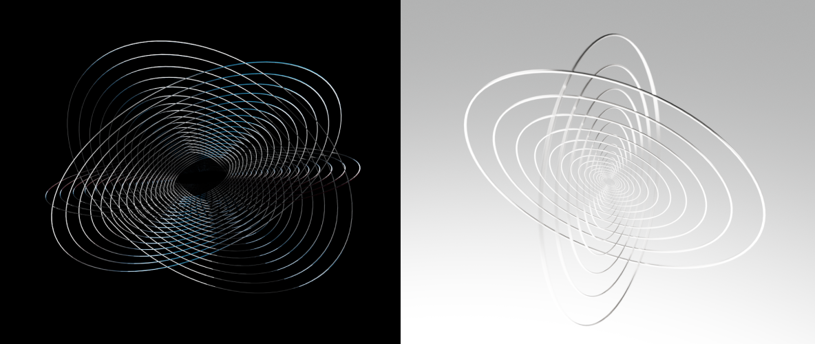
To improve the design, we decided to play with the mass. Instead of one spinning surface, we introduced two disks with multiple internal circles. And we kept the same story – showing a single qubit first, then 12 qubits that go inside the superconducting chip and a chip. Here is how the film looked in this style:
It was definitely an improvement over the previous video — the qubit visualization looked cleaner, and the chip layers were more accurate and closer to the real chip.
But we still couldn’t resolve the scalability issue—it was hard to recognize the qubit as it transitioned from a larger size to a smaller one within the chip. Without proper scalability, it was just a three scene changes and not a story. And, like the previous video, it felt quite plain and didn’t evoke any emotions.
So, we decided to make it more engaging by simplifying and utilizing graphic design techniques. We used a front perspective, added stylization, and created a more dynamic rhythm.
This version felt more alive. That was something good enough to use for the social media post.
But it was still far from what we had in mind. It wasn’t very creative, meaningful, or satisfying to watch. After all the effort, it felt just okay.
At this moment, we felt like complete losers not up for the task, stuck and sad. For about a day. During our next daily sync-up, we went through a retrospective and decided to face the reality, which was:
1. Our storytelling sucked. We did not know how to present the 3D motion in a way that felt cinematic rather than like a user guide.
2. Our computers sucked. We couldn’t preview simulations, and cloud rendering was slow, taking days to produce a few seconds of average animation, often completely crashing with more complex graphics.
As we identified these issues, two wonderful things happened:
First, our designer Tanya, based in LA, randomly met a film director at her local coffee shop. Curious about why and how a 3D motion branding team might need cinematography knowledge, he introduced us to his friend, another film director. These incredible guys reviewed our style and approach, offered valuable advice, and handed Tanya a book that turned out to be an absolute gem for us: Film Directing Shot by Shot by Steven D. Katz.
Second, I overcame my lifelong fear of loans and debt and decided to get us the expensive machine tailored for complex 3d model renderings.
It took us about four weeks to figure out the required setup, order all the components, and assemble a machine powerful enough to bring to life what we envisioned.
Learn what video we put together in the final Part 3 of our quantum chip visualization story.
If you liked any concept from this article
and want to extend it to a design system,
creative content kit, or campaign,
fill out the form or schedule a call,
and we’ll get back to you ASAP.